
Product owners often expect dashboards to be part of their product. It makes sense - dashboards bring clarity and highlight the next actions to take, making them a valuable feature for users.
The more complex question is: what data should be tracked and how should it be shown? That’s where many teams get stuck.
This article is here to help. We’ll walk through the steps of preparing analytics and dashboards, show which types of data visualizations to use, and share real examples from our client projects - from EdTech and FinTech to logistics, property management, and health.
Step 1: Define the Audience and Purpose
Before talking about charts, metrics, or colors, start with one simple question: who is this dashboard for?
A dashboard built for a manager looks different from one designed for an end-user. Managers care about team performance and ROI. End-users care about their own progress. Regulators might need compliance data, while operations staff want real-time task status.
That’s why the first step is defining both the audience and the purpose:
Audience – Who will use it? (e.g., admin, manager, end-user, regulator)
Purpose – What decisions or actions should it support?
Examples from our projects:
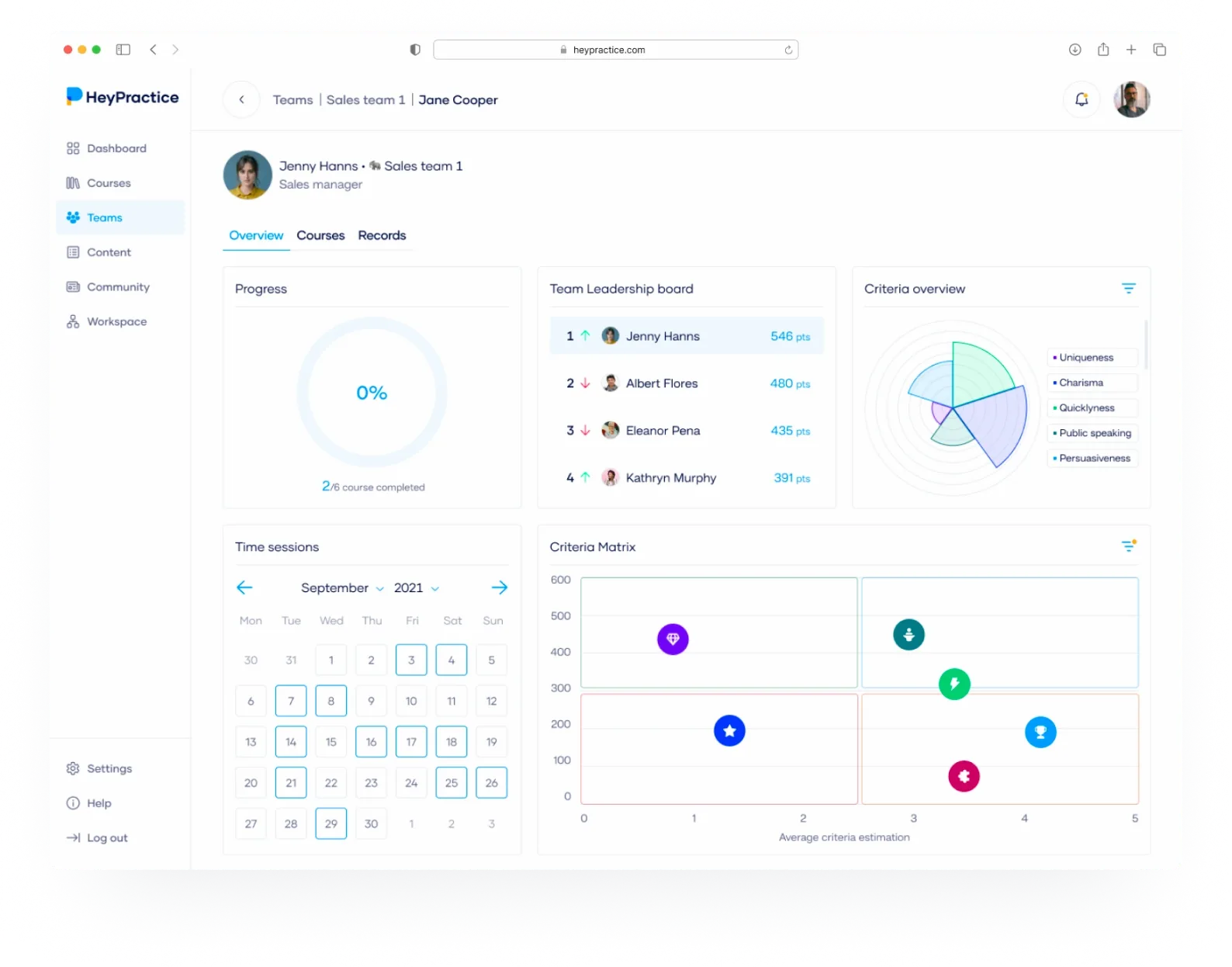
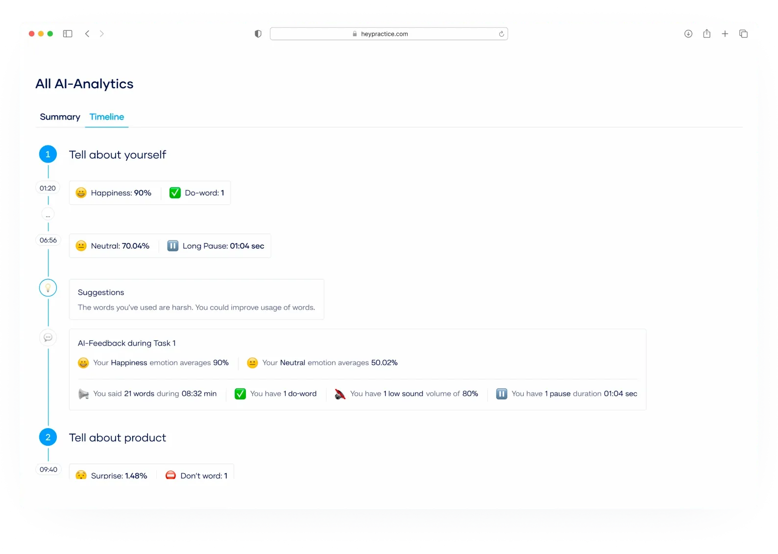
HeyPractice: We built two dashboards. Employees got personal progress views to track their training, while managers saw team-level dashboards to monitor skills and ROI.
HOA Management App: Residents needed a self-service dashboard to check balances and vote online. Managers, on the other hand, needed a consolidated view of accounts and tasks.
Backbone: For event production, dashboards served multiple audiences - internal teams, suppliers, and even clients - each with tailored access to the same event schedule.

When you give your dev team clear answers about audience and purpose, you set the foundation for a dashboard that actually supports decisions instead of being just a pretty report.
Step 2: Decide on Metrics That Matter
Once you know who the dashboard is for, the next step is deciding what data they really need to see.
This is where many dashboards fail - they look nice but show vanity metrics that don’t drive action.
The key is to connect every metric to a decision or behavior:
- Does this number help someone act faster?
- Does it reveal progress or a problem that needs attention?
- Will it reduce the need for manual reporting or support requests?
Examples from our projects:
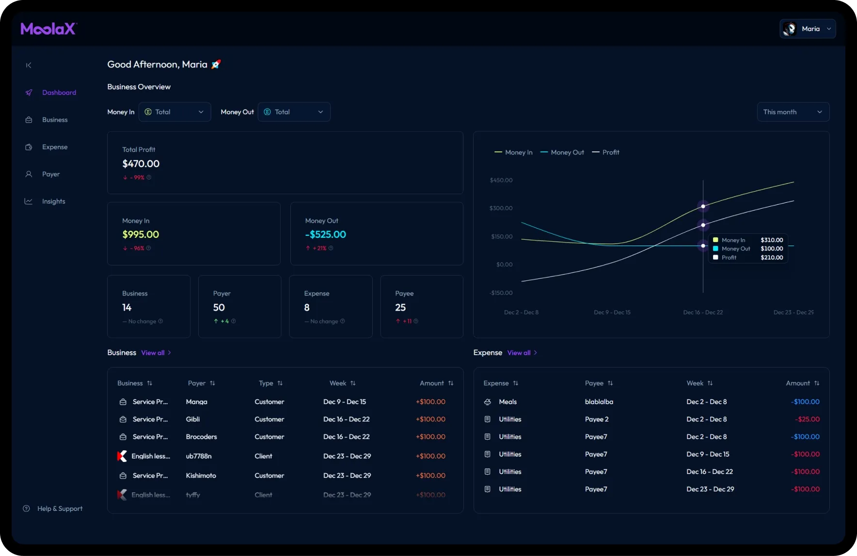
- MoolaX: Instead of overwhelming freelancers with accounting jargon, we focused on three metrics: Money In, Money Out, and Net Profit. These are the essentials for making financial decisions day-to-day.
-
Revenue Boosters: For a company running arcade machines, the critical metric was daily revenue per machine paired with machine status (active, serviced, broken). This gave managers instant clarity on both performance and maintenance.
-
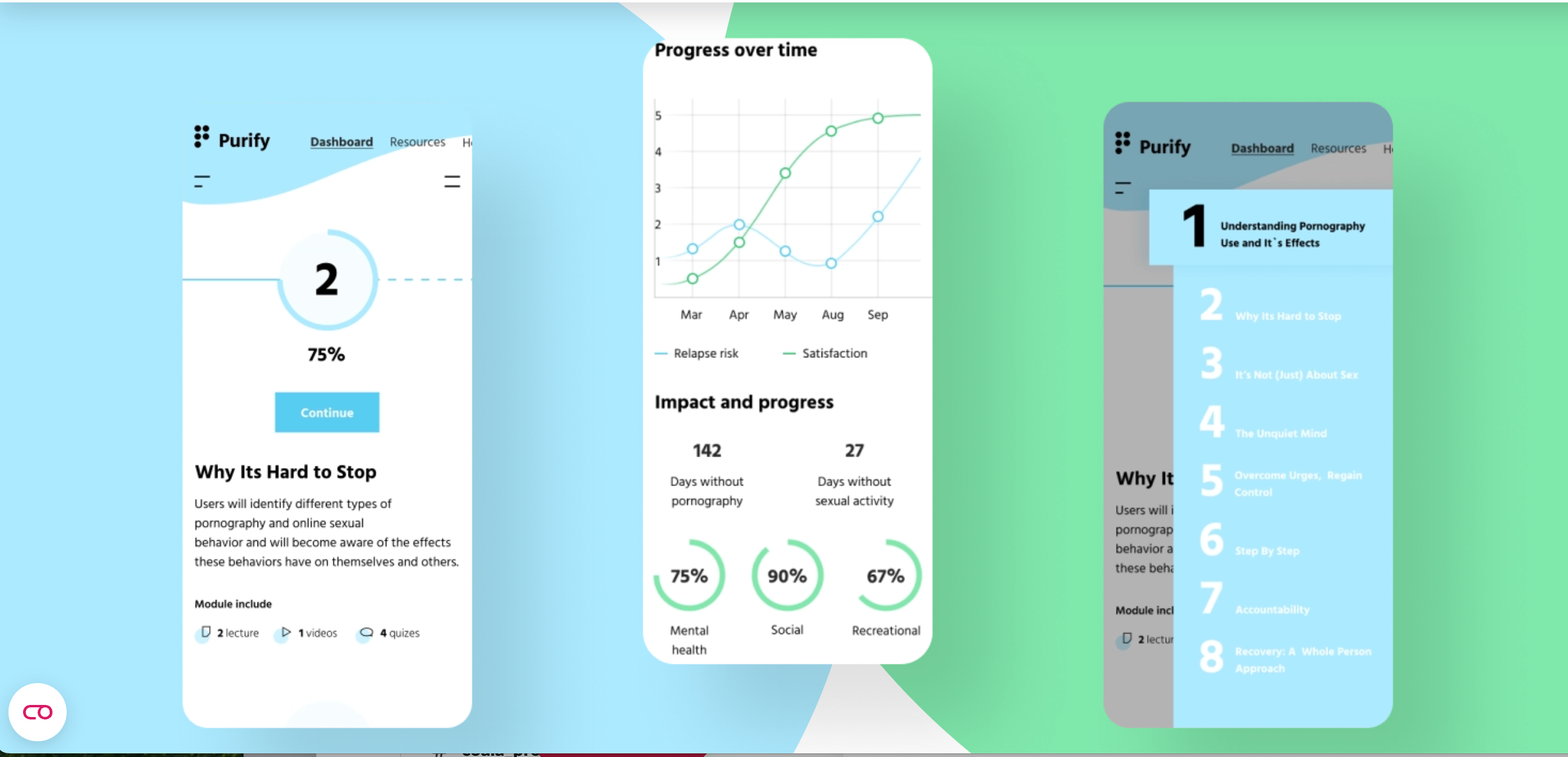
LadderOut: In a mental health app, the important metrics were progress milestones and recovery streaks. These visuals motivated users and helped them stay accountable.
👉 Rule of thumb: if a metric doesn’t guide action, it doesn’t belong on the dashboard.
Step 3: Pick the Right Data Sources
Even the best-looking dashboard is useless if the data behind it is incomplete or unreliable.
That’s why the next step is clarifying where the numbers come from and how often they update.
Two questions to start with:
- Source – Is this data coming from internal logs, external APIs, manual input, or a third-party system?
- Frequency – Do you need real-time updates, hourly syncs, or just a daily batch?
Segmented Data Sources by Type
| Case Study | Project Description | Manual Input (Users) | Third-Party APIs / Systems |
|---|---|---|---|
| HeyPractice | AI-based learning platform for sales & marketing training | User-recorded pitches (audio/video) | AI speech-to-text, face/voice recognition, internal performance system |
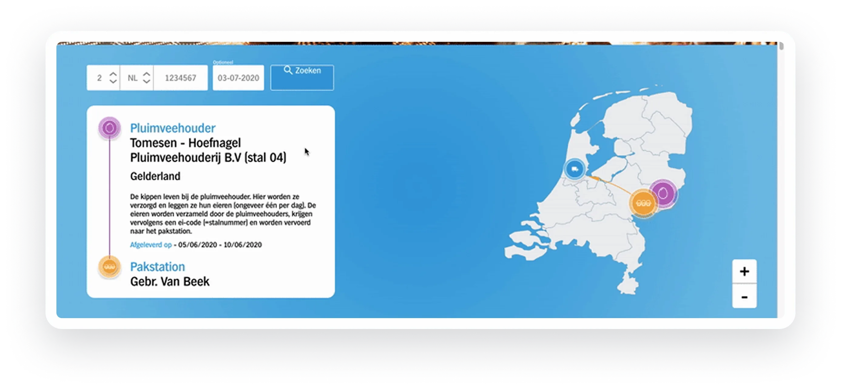
| EveryPig | Swine health & logistics management platform | Caregiver check-ups (symptoms, meds, water use), photos/videos | MetaFarms & FAS vet stats, BarnTool IoT sensors (temperature, water), Google Maps geolocation |
| PayPilot | Payroll software renovation for financial compliance | Payroll details (vacations, fees) | QuickBooks, Xero integrations, government tax forms |
| CondoGenie | Condominium management platform for residents & boards | Resident contacts, pets, vehicles, amenity bookings, task creation | Admin panel reports, community document uploads |
| Revenue Boosters | Route & revenue tracking SaaS for arcade machine operators | Collector logs (cash collected, refunds), route reports | Google Maps, Geoapify for mapping/location |
| Foodtech ERP (OptiChain) | Blockchain ERP for food supply chain traceability | Consumer feedback via app (ratings, photos, comments) | Blockchain platform, supply chain partner batch uploads (origin, certificates) |
| LadderOut | Mental health coaching software for addiction recovery | User profile (age, goals), module answers (triggers, stress, motivators), journal data | — |
| MoolaX | Smart cashflow management app for freelancers & SMBs | Business details (type, clients), outgoing payments descriptions | Stripe integration for transactions and payment trends |
| Backbone | Event production management platform for global teams | Supplier/client updates on events, task assignments | PostgreSQL (schedules), MongoDB analytics |
When you hand requirements to your dev team, be specific:
- Which systems should feed the dashboard?
- How often should the data refresh?
- What happens if data is missing or delayed?
👉 Clarity here saves a lot of rework later and ensures your dashboard tells a story that’s both accurate and timely.
Step 4: Design for Clarity and Usability
Dashboards succeed when people can understand them at a glance.
The goal isn’t to show everything, it’s to show the right things clearly.
Two common mistakes:
- Packing too many metrics into one screen.
- Forgetting that different roles need different views.
Good practices:
- Keep one dashboard = one story.
- Use role-based views so admins, managers, and end-users see only what’s relevant.
- Prioritise simplicity — highlight key KPIs first, then offer detail if needed.
Almost every product that has multiple user roles also assumes the presence of an admin panel.
This is where the product owner or manager can see the entire product analytics in one place and manage users.
Examples from our projects:
- EveryPig: Farmers, vets, and truck drivers all interact with the system, but each sees only their slice of the workflow. Caregivers see health check forms; drivers see logistics routes; managers see herd-level analytics. Clear separation keeps dashboards usable for each role.
- OptiChain (Foodtech ERP): Instead of overwhelming stakeholders with blockchain records, the consumer-facing dashboard shows one clear view: traceability of a single product lot. Scanning a QR code brings up origin, producer, and certifications — no clutter, just trust-building transparency.
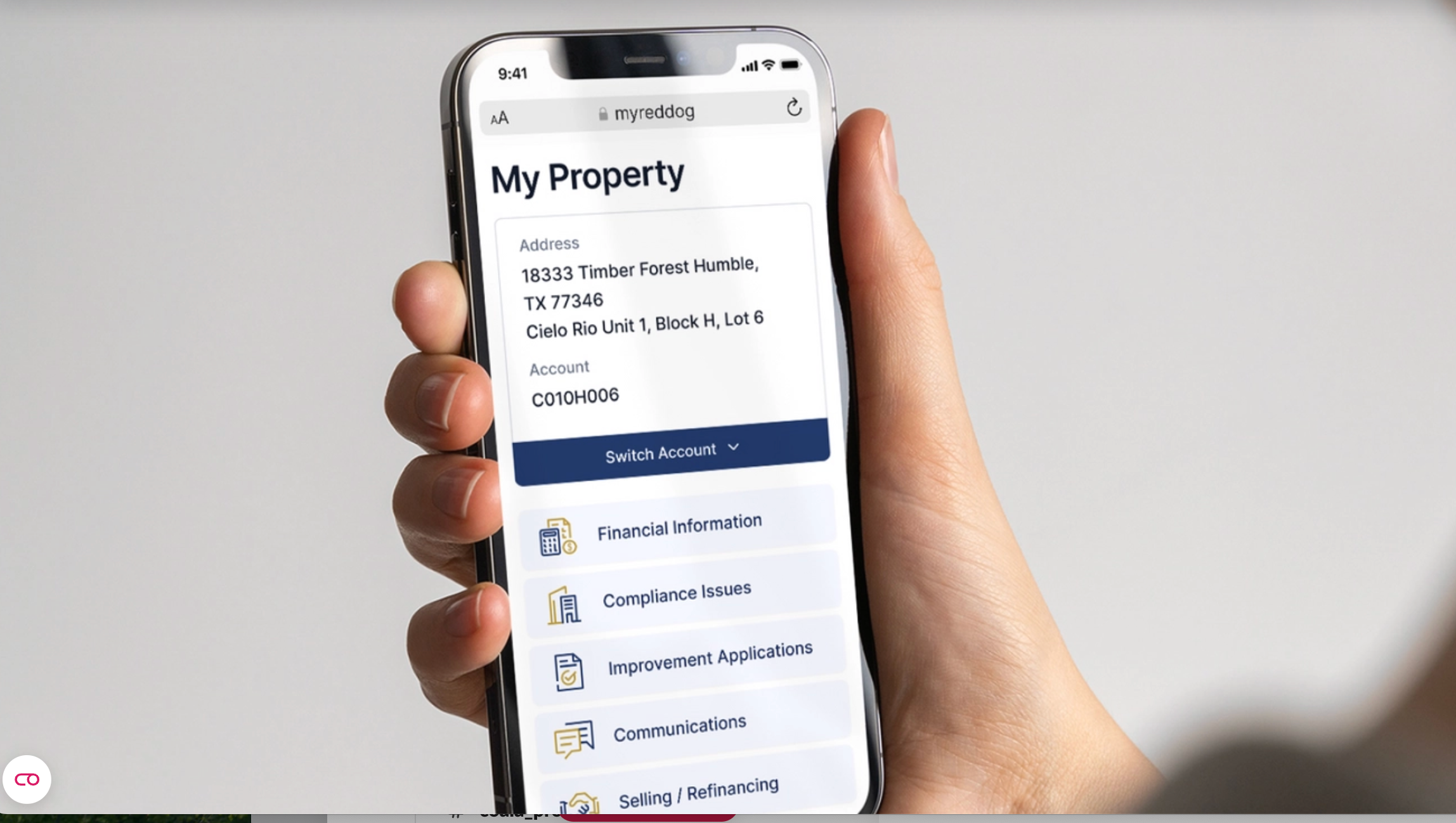
- HOA Management App: Residents get a simple interface for balances, community news, and voting. Managers see a different dashboard with aggregate reports. The split ensures residents aren’t confused by financial admin data, and managers aren’t bogged down by individual requests.
👉 The design principle is simple: a dashboard is only useful if the right person can understand it quickly and act on it.
Step 5: Choose the Right Data Visualization
Even the right metrics can fall flat if they’re presented poorly.
The job of visualization is to tell a story quickly — the user should understand what’s happening without extra explanation.
When to use which type of visualization:
| Visualization Type | Best For | Case Study Example |
|---|---|---|
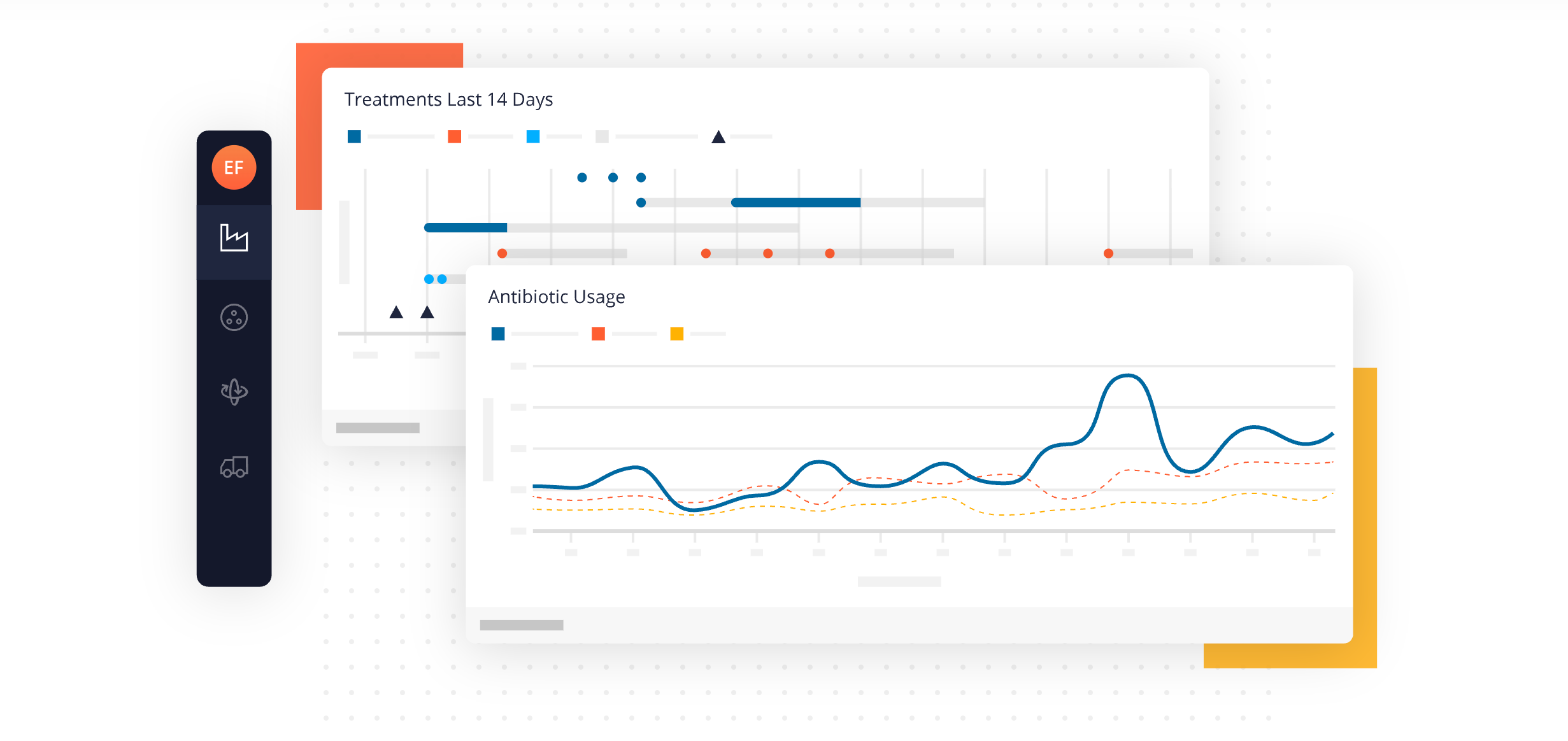
| Line chart | Trends over time | MoolaX: profit trend across weeks/months; LadderOut: user recovery streaks |
| Bar / Column chart | Comparing categories or groups | HeyPractice: training scores compared across team members |
| Pie / Donut chart | Showing proportions | Revenue Boosters: share of revenue by machine type |
| KPI cards / Tiles | One key number that matters | EveryPig: “Pigs transported today”; MoolaX: “Cash available” |
| Table with conditional formatting | Detailed, precise data where accuracy matters | CondoGenie: resident profiles with status indicators; HOA App: account balances |
| Map / Geospatial view | Location-based insights | Revenue Boosters: machine locations; EveryPig: transport routes |
| Timeline / Gantt chart | Scheduling and coordination | Backbone: event activities calendar |
| Progress bar / Goal tracker | Personal progress against milestones | LadderOut: recovery module completion; HeyPractice: employee training progress |
Guideline:
- Use visuals for insight, not decoration.
- If the chart doesn’t help answer a question or spark an action, it doesn’t belong.
👉 A good visualization makes the dashboard self-explanatory — users shouldn’t need a manual to understand it.
Step 6: Add Collaboration & Accountability
Dashboards don’t just inform — they can also align people.
When multiple users rely on the same data, collaboration and accountability features turn a dashboard into a shared workspace.
Ways to add collaboration:
- Shared access with role-based permissions.
- Ability to comment, tag, or assign tasks directly from the dashboard.
- Export or reporting options for stakeholders outside the system.
- Activity logs to track who updated what and when.
Examples from our projects:
- LadderOut: Users could invite a support person to view their recovery progress. This external accountability boosted motivation and made the dashboard more than just personal stats.
- Revenue Boosters: Field collectors logged revenue and machine statuses. Managers immediately saw this data in their dashboards, creating a feedback loop of accountability.
- CondoGenie: Residents submitted maintenance requests through their dashboards. Property managers tracked status updates, so both sides stayed accountable until the task was resolved.
👉 Collaboration ensures that dashboards aren’t static. They become tools for teamwork, with every user accountable for their part of the process.
Step 7: Checklist for Product Owners
Before handing requirements to your dev team, make sure you can answer these questions:
- Audience – Who will use the dashboard? (Admin, manager, end-user, regulator)
- Purpose – What decisions or actions should it support?
- Metrics – Which numbers matter most, and do they guide action?
- Data Sources – Where does the data come from (manual input, APIs, internal systems)?
- Refresh Rate – How often should the data update (real-time, daily, weekly)?
- Visualization – Which chart types or views make the data easiest to understand?
- Roles & Views – Do different users need different versions of the dashboard?
- Collaboration – Should users be able to share, comment, or assign tasks from the dashboard?
- Accountability – Do you need activity logs or progress tracking for transparency?
- Business Goals – How does this dashboard tie back to ROI, efficiency, or user engagement?
👉 If you can check off each of these points, your developers will have a clear blueprint, and your dashboard will be built to deliver real value instead of vanity charts.
Conclusion
Dashboards aren’t decoration. They’re the lens through which founders, managers, and users see the truth about a product.
When designed well, they do three things at once:
- Give clarity so decisions can be made faster.
- Cut workload by reducing manual reporting and support requests.
- Keep users engaged by showing visible progress and outcomes.
Across our projects — from EdTech to FinTech, supply chains to community apps — the dashboards that worked best all started with the same foundation: clear requirements. Who’s the audience? What data matters? Where does it come from? How should it be shown?
If you prepare these answers before development starts, you’ll save time, avoid rework, and end up with dashboards that people actually use.
👉 At Brocoders, we’ve helped clients turn vague requests like “we need a dashboard” into powerful tools for growth and transparency. If you’re ready to do the same for your product, let’s talk.